Latest Posts:
  • Predicting MotoGP Race Outcomes, Which Session Matters Most?
  • As the Honda Transalp Arrives, Wherefore Are Thou Africa Twin?
  • The Honda XL750 Transalp Finally Returns
  • Does WorldSBK Need a Minimum Combined Bike/Rider Weight?
  • Bimota About to Debut a “TERA” Supercharged Adventure Bike?
  • Bimota BX450 Dirt Bike Leaks Ahead of EIMCA Debut
  • Repsol Extend Sponsorship Deal With HRC Through 2024
  • MotoGP Preview of the Valencia GP: Can Anyone Stop The Ducatis?
  • Facebook
  • Twitter
  • Instagram
  • RSS
  • YouTube
  • SoundCloud
Asphalt & Rubber Asphalt & Rubber
  • About
  • A&R Pro
  • Podcasts
  • Advertise
  • Contact
  • Log In
WSBK

WorldSBK Unveils a New “SBK” Logo & Brand Identity

By Jensen Beeler 11/22/2021 3 Comments
Share on Facebook Share on Twitter Google+ Pinterest LinkedIn Tumblr Email

The WorldSBK Championship may have just wrapped up in Indonesia, but the series is already looking towards the future. On that vein, WorldSBK has a new “SBK” logo

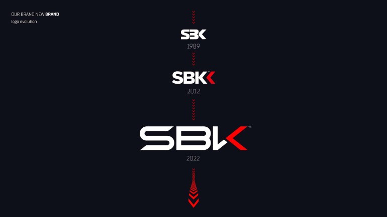
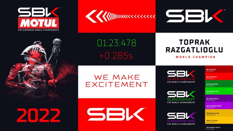
As such, Dorna has debuted a brand refresh for the WorldSBK Championship, including a new, more modern-looking “SBK” logo and font, which was done by British firm Designwerk.

The logo is a take on the classic chevron look that WorldSBK debuted back in 1989, though the tagline “We Make Excitement” is a new take, and perhaps only relevant to the most recent season, after Jonathan Rea’s past dominance.

Targeting a younger demographic of racing fan, the presumption for the brand refresh is to appeal to a new generation of racing enthusiasts, and to make WorldSBK more appealing in a 21st century media environment.

Interestingly enough, WorldSBK is boasting that it’s the third-most popular motorsport series, right behind F1 and MotoGP.

“The refresh of our brand identity has meant a step further towards times to come, along with our fans, whilst preserving our traditional brand image made of passion, energy and spontaneity,” Francesco Valentino, Head of WorldSBK Commercial & Marketing.

“A brand refresh is a major undertaking and we’re pleased to have reached our goals: the need for a consistent and coherent visual language for all the channels our brand is present on was obvious.”

“The evolution of our logo and overall Brand Identity remains true to our core values while assimilating the ways our fans interact with SBK, watching it on TV, playing it as a videogame or enjoying it on social media. More than ever, we make excitement.”

Source: WorldSBK

Related Posts

Does WorldSBK Need a Minimum Combined Bike/Rider Weight?

11/08/2022

Paddock Pass Podcast Episode 276 – WorldSBK at Assen

05/11/2022

Paddock Pass Podcast Episode 256 – Interview with Neil Hodgson

12/17/2021

Paddock Pass Podcast Episode 255 – WorldSBK 2021 Review

12/08/2021

Provisional 2022 WorldSBK Calendar Released with 12+1 Rounds

11/29/2021

Paddock Pass Podcast Episode 254 – WorldSBK at Mandalika

11/28/2021

Comments

  • Follow us
    • Facebook
    • Twitter
    • Instagram
    • YouTube
  • Listen to the Latest Paddock Pass Podcasts
  • Listen to the Latest Brap Talk Podcasts
  • About Me
    Facebook Twitter Instagram RSS YouTube SoundCloud
  • Latest Posts
    • Predicting MotoGP Race Outcomes, Which Session Matters Most?
      MotoGP 11/29/2022
    • As the Honda Transalp Arrives, Wherefore Are Thou Africa Twin?
      A&R Pro 11/08/2022
    • The Honda XL750 Transalp Finally Returns
      Bikes 11/08/2022
  • Most Popular
    • KTM’s Stefan Pierer Gobbles Up 25% of MV Agusta
      News 11/03/2022
    • The BMW M1000RR Superbike Takes Another Step Forward for 2023
      Bikes 10/11/2022
    • The BMW S1000RR Gets Wings and Updates for the 2023 Model Year
      Bikes 09/29/2022

© 2008-2020 Asphalt & Rubber

Top
Asphalt & Rubber